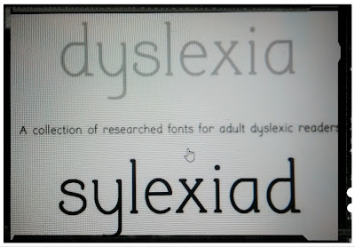
There are several
fonts that have been designed for the dyslexic readers to ease their reading.
Lexia Readable (Keith Bates, 2004),
Dyslexie (Christian Boer, 2008),
Dyslexie (Christian Boer, 2008),
OpenDyslexic (Abelardo
Gonzalez, 2011),
Read Regular,
Sylexiad (Dr. Robert Hillier, 2006),
Sylexiad (Dr. Robert Hillier, 2006),
and more...
Let’s have a closer
look.
Lexia Readable
Originally created by Keith Bates in 2004
Lexia Readable (or Lexie Readable)
was designed by Keith Bates in 2004 to capture the strength and clarity of
Comic Sans.
This font can be freely
downloaded from either the K-Type web site or from the Dyslexia.com site. It is
free for individual use, or for use by academic or charitable organizations.
For commercial licensing, there is a one-time fee.
Dyslexie is a typeface
font developed and designed by Christian Boer, dyslexic himself, a Dutch graphic
designer, to moderate some of the issues that people with dyslexia experience
when reading. He worked on it to help fight his own dyslexia.
Dyslexie font was a finalist for
the Fast Company Innovate Through Design Award in 2012 and went on to many
highlights in 2013, including a nomination for the Rabobank New Generation
Pitch.
Typeface That Helps Dyslexics
Read
Christian Boar designs typeface
for readers with dyslexia, by Dan Hawarth, 9 November 2014
Christian Boar designs typeface -
letters
http://static.dezeen.com/uploads/2014/11/Dyslexie-typeface-by-Christian-Boer-dezeen_468_2_1000.jpg
OpenDyslexic
OpenDyslexic
Created by Abelardo Gonzalez in 2011
OpenDyslexic is a free
typeface/fond designed to mitigate some of the common reading errors caused
by dyslexia.
The typeface was created by Abelardo Gonzalez, who released it through an
open-source license. The design is based on that of Déjà Vu Sans,
also an open-source font.
Read Regular is a typeface
designed specifically to help people with dyslexia read and write more
effectively. Read Regular aims at preventing a neglect of dyslexia,
creating a more confident feeling regarding the problems that occur with
dyslexia.
Dr. Robert Hillier, a Senior
Lecturer at Norwich University College of Arts designed and developed ‘Rob’s
Fonts’. One of them is Sylexiad font for adult dyslexic readers, presented as
part of his doctoral research (2006).
To read more
Dyslexia Font and Style Guide
Typefaces for dyslexia
Typeface writing
Dixy: A Connection Between the “Typographic
Appearance” and the Brain of Children, María Fernanda del Real García, Universidad
Autónoma de Barcelona, Bellaterra, Spain
Journal of Literature and Art
Studies, ISSN 2159-5836, January 2014, Vol. 4, No. 1, 55-61
“The third type of letter (Dixy) was
specially developed for typographic research purposes, following graphic
features that according to literature and previous studies on reading patterns
favor the dyslexic, and could improve reading skills in these individuals. To
examine the quality of reading (speed and accuracy) between fonts, a small—but
significant—sample was used. Ten children in Madrid, from eight to 10 years old
were examined while reading words and pseudo words with three different fonts (Arial, MeMimas,
and Dixy). The result of the study shows the influence of the shapes of the
letters in the legibility of texts with familiar and unfamiliar words (pseudo words)
in children with dyslexia. The study showed that using the font Dixy, despite
not being known by the children, reading is more accurate than using fonts known
to them, such as Arial and MeMimas. As to the reading speed, the results
indicate that, although the Dixy is a font never seen before by the children,
reading speed is similar to a known font for them, as is the Arial, and greater
than a hand writing font such as MeMimas.” Page 55
Good Fonts for Dyslexia by Luz
Rello and Ricardo Baeza-Yates
Do Dyslexia-Friendly Fonts Really
Work? By Guinevere Eden, Ph.D.
“Since then, however, there have
been three solid, peer-reviewed research studies on these fonts. They were done
in 2016, 2017 and 2018. Together they conclude that the Dyslexie or Open Dyslexic
font have no measurable benefits or deliver any reading gains.
It’s important to create the most
successful learning environment for your child. But the most valuable thing is
to get your child the best instruction possible to build skills. That means
using evidence-basedapproaches that are shown to improve reading.”


No comments:
Post a Comment